Build modern and robust Canvas apps with a minimalist design
Best Practices Canvas Apps Power Apps User Experience Development Microsoft 365 Power Platform Software Engineering UI/UX DesignThere is no single way to build modern and robust Canvas Apps using a minimalist design – good design (or what is considered good design) is subjective and varies from one developer to another. However, there are some key principles – especially when building Power Platform Canvas Apps – and best practices that can help guide the design process.
The role of design frameworks
Design frameworks are essential for creating modern and robust Canvas Apps: they provide a set of guidelines, components, and best practices that help developers create consistent, user-friendly, and visually appealing applications. In the context of Power Platform Canvas Apps, design frameworks can significantly enhance the user experience and streamline the development process.
I want to start emphasizing three points why the use of design frameworks in general is essential to me:
-
In modern apps, usability and design go hand in hand; it’s essential that Power Platform Canvas apps are not only functional but also look good. Functionality should not come at the expense of aesthetics.
-
Design frameworks like Microsoft’s Fluent UI try to make design and interaction behavior (and the code that goes with it) more consistent. The goal is to create apps and solutions that look and work in a simple and organized way and to standardize the look & feel of an app. The platform you choose for your app and the framework you use to create it doesn’t matter: either Power Apps Studio for Canvas Apps or SPFx for SharePoint apps – or anything else.
-
A minimalist design ensures that the use of design elements is reduced to a minimum so that a clear and effective UI message can be conveyed; it not only improves the user experience, but also ensures intuitive navigation which «guides» the user in using the app. Design frameworks play a crucial role in achieving this by providing pre-defined styles and components because they most often adhere to minimalist principles.
My approach to minimalist design for Power Platform Canvas Apps
«We want to have a great looking app with a clean structure that is easy to navigate» – do you hear this kind of requirement (that often comes from the customer) as well? To me, it happened a lot of times that customers expressed this «need» (although they might not have used the term “minimalistic design”). 😃 Great requirement, but how should we achieve this?
Minimalist design in the context of Power Platform Canvas Apps refers to a design approach that emphasizes simplicity, clarity, and functionality. It involves using fewer (different) design elements, focusing on essential features, and creating a clean and intuitive user interface:
Important
Always use modern controls in Canvas apps.
Be consistent in your design choices to create a cohesive user experience throughout all the apps and solutions that you build. Avoid using UI controls, forms and input fields that look like UI elements from an educational tool for children learning how to program 😃. Therefore, consider the following «rules of thumb»:
- Keep layouts simple and easy to follow;
- Use a limited set of fonts, font sizes, colors, and buttons that are provided by the design framework to create a cohesive look and feel;
- Maintain a clean canvas by including only necessary elements and fields – and group them logically;
- Utilize whitespace effectively (and only to create a sense of openness and to separate different elements instead of cramming everything together), do not disperse UI elements across the canvas;
- Build clear navigation to ensure that user flows seamlessly integrate into the user interface
Note
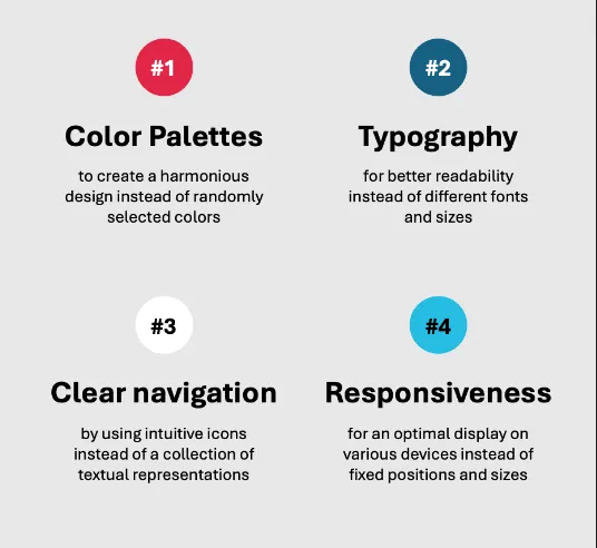
We should create user interfaces that are easy to use by using color palettes, modern fonts and icons and a navigation that is easy to understand.
My six design principles
My belief and paradigm (as you probably already guessed 😃) is to «Build apps as you would do as a professional developer writing code». Therefore, I always take into consideration these six simple design principles when it comes to building or modifying an app:
-
Rely on design standards and UI components to reach the goal of building an consistent UI with well-coordinated and matching components.
- Always use modern controls instead of the old controls that you had to adjust in color, font, font size and so on by every use
- Use design tokens (a named variable to describe sth.) for colors that are pre-defined in a color palette (or even in your own color palette) – instead of defining the components’ colors every time you use them
-
Think building a «single page application»: use multiple screens that visualize the different use cases or stories in your app. Every use case asks for its according components and controls; if you separate the use cases, you also separate the necessary UI components into smaller bits. By doing so, you avoid overloading the canvas and overwhelming users with an excessive number of different UI components or controls.
- It’s always good to use a new screen that covers a dedicated use case and its related components
- Think as the screen stands for a «UI Component with its related sub elements»
-
Use containers to structure your app and to create a consistent layout with all your design components. Containers are fun (ok, and sometimes little beasts as well 👻) – but nevertheless, make use of them… to make content fit the screen and to keep an always-the-same approach to display UI content. They help manage layout and alignments, making it easier to create responsive designs and organize elements.
- Try using a «container concept» within in the whole app (or over all your apps)
- My concept:
Rootcontainer >Headercontainer with: navigation components & action controls (buttons & action toolbars) >Maincontainer with:ContentorDetails(andFootercontainer if necessary)
-
Be consistent in navigation to provide clear and «easy to follow» rules on how to find the specific app content or use cases and UI actions
- I always use a Home Screen to make the primary user stories visible from beginning to end; this is how the user gets into the app
- In sub-screens, always a «navigation ribbon» like a «navigation container» to get back to the Home screen
- Always make the primary actions available beneath the Home button, separated by a vertical line which acts as a divider
- Talking about separators: use separators to separate different menu actions and to aggregate them into respective action groups
- In case of lots of menu actions, create a «nested» menu!

-
Separate (data) actions from data visualization
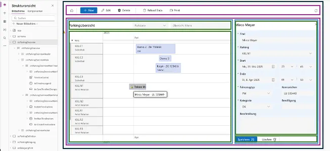
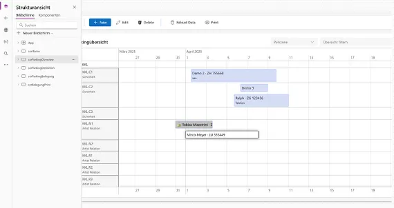
- always use tables or lists to display the data (and only the data!)
- always move the data actions to the navigation container on top of your canvas
- always position «Save» or «Reset» buttons underneath the form where you mutate the data
- always use the «Disabled» attribute when a menu item is not selectable→ reduce the «hidden» state to the minimum, or don’t use it if you don’t have to – better display an item and change its state instead of conditionally hide or show
-
Encapsulate app behaviour and app logic: Use formulas to avoid duplication of logic and to boost performance
- As they are evaluated at runtime
- Always transform data in a «fetch-data» formula instead of implementing the same data transformation on multiple elements or in multiple screens
Note
Make a template or a reference app that contains all your «standards» for the design, the navigation, the UI components – by grouping them into different type of screen layouts. By doing so, you simply can copy & paste the screen layouts and apply it on your canvas in you new app(either by pasting the whole screen or only applying the YAML definition).
Conclusion
By relying on proven architectural principles and using modern components – that are provided by the (design framework of the) Power Platform –, we develop apps that are not only convincing from an aesthetical perspective, but also technically robust and scalable. In my understanding, good UI design goes hand in hand with good app architecture.
That’s it – what do you say: fool or cool? Have fun and keep coding! 😃